Graphic Design Final Portfolio Spring 2020 | Professor: Stephen Zhang | Major Campaign
Design by Katelyn Salinas
Assignment Brief
The goal of the project was to find a niche or gap in the market, and design a product that fills that space.
I researched a few market and came across a gap in the tissue industry. I found that there were various tutorials on DIY aromatherapy tissues. While there were so many tutorial there was no product currently that catered to that need for aromatherapy tissues. I decided to design a series of aromatherapy tissues for Puffs.
My next steps included researching popular aromatherapy scents and picking three. I decided on Eucalyptus, lavender, and lemon.
Below is the final design for the aromatherapy tissue.
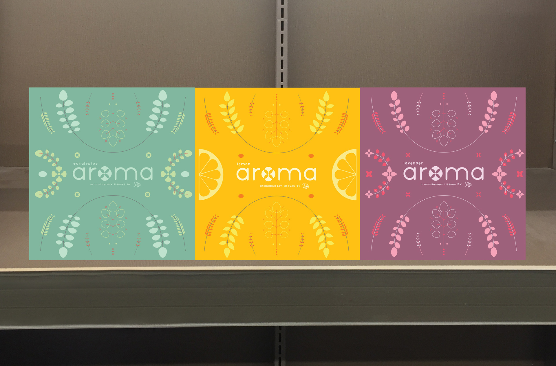
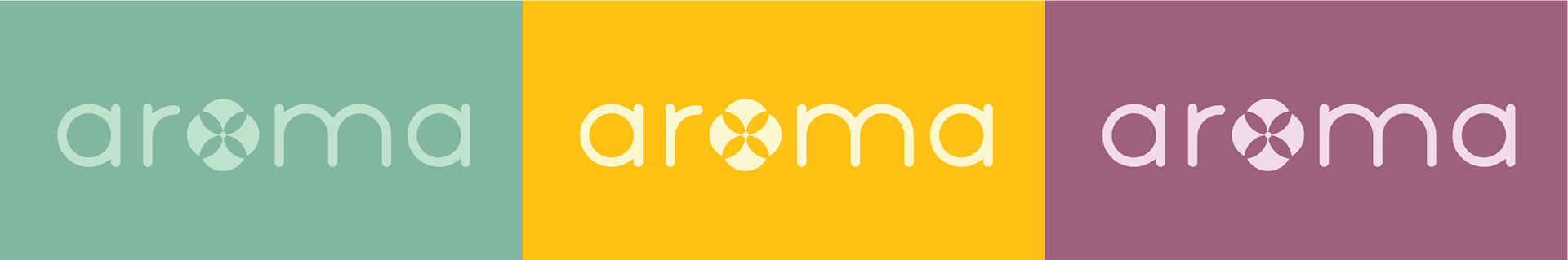
As seen above they have similar packaging to connect and demonstrate that they are from the same series. I created similar patterns that fit around the box and symbols that connected to bring unity to the series. I was trying to create harmony across the boxes so I created a pattern that was symmetrical and organic. The shapes on the boxes when side-by-side create complete circles to emphasis unity.

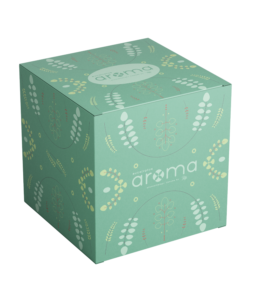
Eucalyptus
For the eucalyptus box I focused on the color and shapes that match eucalyptus. Eucalyptus from my research was often associated with green because of there leaves.

Lemon
I focused on using yellow because lemons are yellow. I used various shades of yellow to develop the color scheme for the lemon aromatherapy.
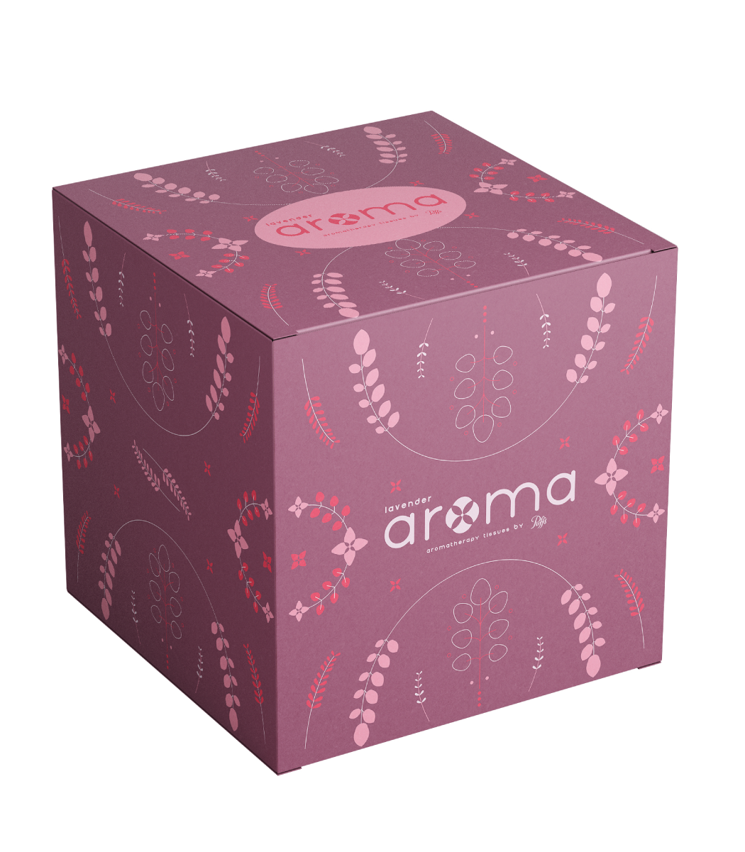
Laveneder
When looking at lavender the color of lavender is often dull so to brighten the packaging I decided to use a more saturated and deep purple color with softer pink tones.