Graphic Design Spring 2018 | Professor: Douglas May | Client: Zoo York | Design by Katelyn Salinas
Assignment Brief
The goal for this assignment was to redesign the logo for the company our professors assigned. I was assigned Zoo York.
The goal for this assignment was to redesign the logo for the company our professors assigned. I was assigned Zoo York.
Concept
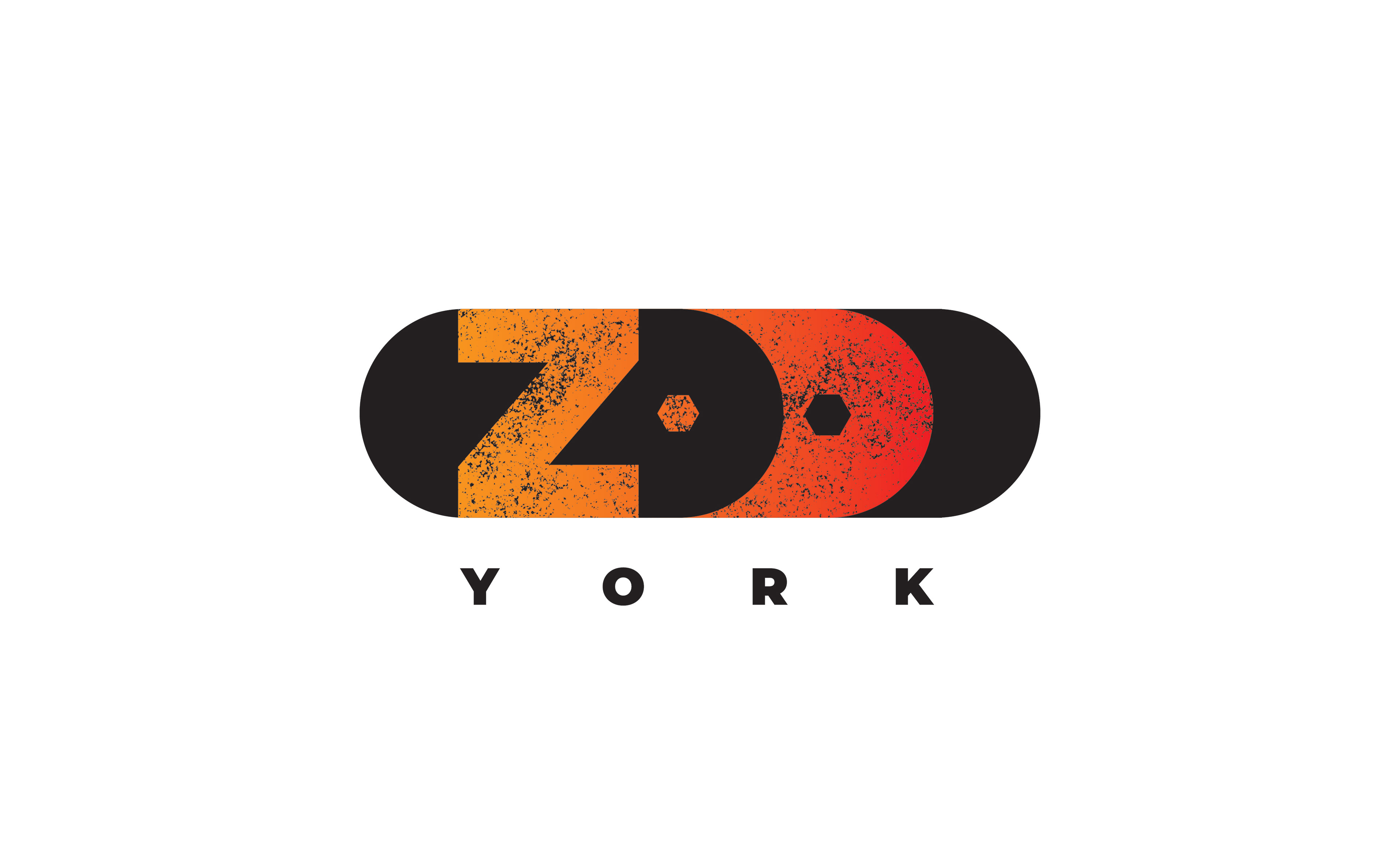
Zoo York is a well known skateboard company that sells skateboards, shirts, apparel, sneakers, etc. Since it is well known for its skateboards I used a silhouette of a skateboard to create the basic shape. I found a bold type that fills the space inside the silhouette. The O's symbolize the wheels of the skateboard with a gear as the middle of the O's and how it is always moving forward. I used a gradient of orange to red and a texture to help represent graphite since Zoo York mission is to represent New York's street culture. It is also a hint to their history of spray paint art around New York and on their skateboards.
Zoo York is a well known skateboard company that sells skateboards, shirts, apparel, sneakers, etc. Since it is well known for its skateboards I used a silhouette of a skateboard to create the basic shape. I found a bold type that fills the space inside the silhouette. The O's symbolize the wheels of the skateboard with a gear as the middle of the O's and how it is always moving forward. I used a gradient of orange to red and a texture to help represent graphite since Zoo York mission is to represent New York's street culture. It is also a hint to their history of spray paint art around New York and on their skateboards.